This article provides a step-by-step guide on how to create compelling line charts using Matplotlib. The author explores various techniques to enhance the visual appeal and readability of the charts. The article includes code snippets and examples to illustrate the concepts. The final result is a professional-looking line chart that effectively tells a story. The author encourages readers to contribute their improvement ideas and mentions that future articles will cover other types of charts.
How to Use Matplotlib to Create Compelling Line Charts
Motivation
In a previous article, we discussed how to create beautiful bar charts using Python. Now, let’s explore line charts and how to make them visually appealing and self-explanatory.
Matplotlib is a powerful tool for plotting data, but fine-tuning the charts can be time-consuming. That’s why we’ve done the research for you and compiled best practices to help you create compelling line charts with ease.
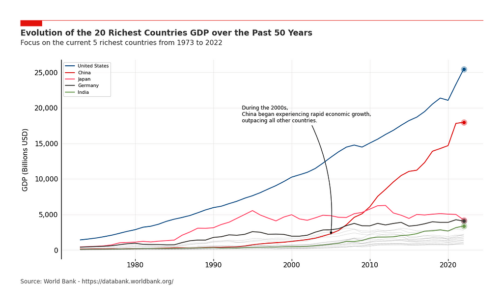
The Data
To illustrate the methodology, we’ll use a public dataset containing GDP information for the top 20 countries over the past 50 years. This dataset is sourced from the World Bank and OECD National Accounts data files.
The Basic Plot
To start, we only need four lines of code to create the figure and plot the lines for each country. This basic plot gives us a starting point for further enhancements.
The Essentials
To make our chart more readable, we’ll add a few essential features:
– Grids: We’ll add grids to improve readability, with a transparency of 0.5 to avoid interfering with the data points.
– X-axis and Y-axis reformatting: We’ll adjust the formatting of the axis labels and tick labels to make them more visually appealing.
– Legend: As we’re displaying multiple lines, it’s important to add labels and a legend to differentiate them.
Focus on the Story to Tell
Next, we’ll highlight the GDP evolution over time for the five richest countries. We’ll define specific colors and line styles for these countries to make them stand out.
The Professional Look
To give our chart a more professional appearance, we’ll add a few extra features:
– Spines: We’ll remove all spines except for the left one, which will be slightly thicker.
– Red line and rectangle on top: We’ll add a red line and rectangle above the title to visually separate the graph from the text.
– Title and subtitle: We’ll add a title and subtitle to introduce the graph and provide additional context.
– Source: We’ll include a source reference for credibility.
– Margin adjustments: We’ll adjust the margins around the plot area to optimize space usage.
– White background: We’ll set a white background for better visibility when sharing the chart.
The Final Touch
To complete our chart, we’ll add a few final components:
– End Point Markers: We’ll highlight the last data point of each line with markers to make them stand out.
– Annotations: We’ll use annotations to highlight specific points in the graph and add comments.
Final Thoughts
This article aimed to provide practical guidance on creating compelling line charts using Matplotlib. We’ve shared reusable code snippets and encouraged readers to suggest improvements.
If you’re interested in leveraging AI to transform your company, consider following the 5 steps outlined in this article. For AI solutions and advice, connect with us at hello@itinai.com. Stay updated on AI insights through our Telegram channel t.me/itinainews or Twitter @itinaicom.
Spotlight on a Practical AI Solution:
Explore the AI Sales Bot from itinai.com/aisalesbot, designed to automate customer engagement and manage interactions across all stages of the customer journey. Discover how AI can redefine your sales processes and customer engagement. Visit itinai.com for more information.
List of Useful Links:
- AI Lab in Telegram @aiscrumbot – free consultation
- 5 Steps to Beautiful Line Charts in Python
- Towards Data Science – Medium
- Twitter – @itinaicom